France Book Tours is experimenting with a possible update of tour banners.
So let us know,
between
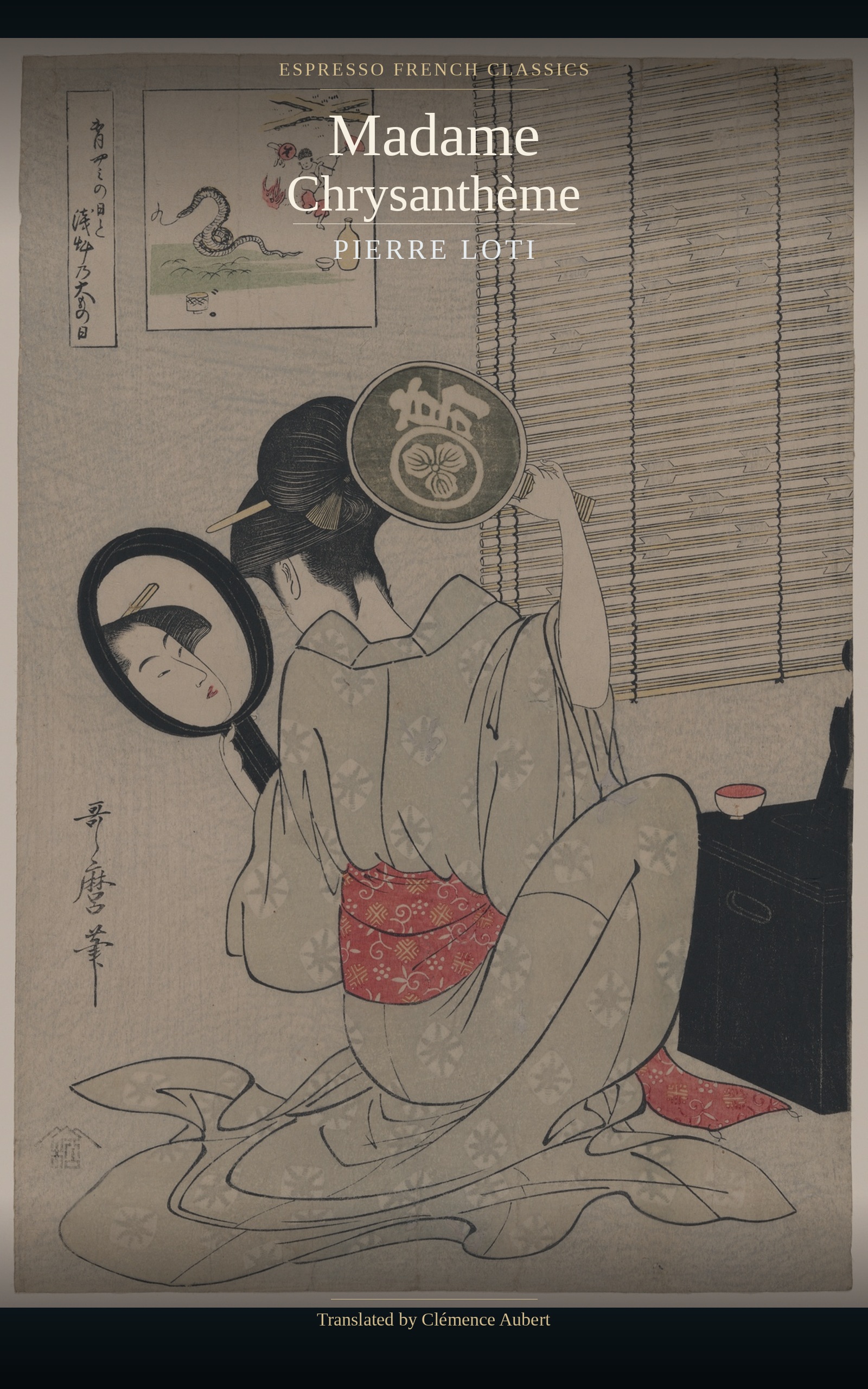
BANNER A

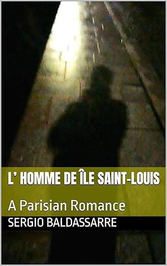
BANNER B

and
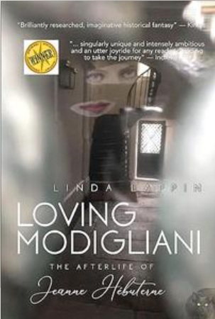
BANNER C

what’s your preference?
Please leave a comment explaining why.
Feel free to add ideas to improve
France Virtual Book Tours: a promotional tool to connect authors with bloggers with a passion for France
France Book Tours is experimenting with a possible update of tour banners.
So let us know,
between
and
what’s your preference?
Please leave a comment explaining why.
Feel free to add ideas to improve


<div align="center"><a href="https://francebooktours.com/" rel="nofollow" title="France Book Tours"><img src="https://francebooktours.files.wordpress.com/2013/04/fbtbannerwidget.jpg" alt="France Book Tours" style="border:none;" /></a></div>

 November 10, 2014
 WordsAndPeace
17 responses to “New style banner?”
Martha G
November 10th, 2014 at 21:03
I like the clean lines of Banner C. The blue dotted lines in B are distracting so is the white border of Banner A.
WordsAndPeace
November 11th, 2014 at 15:32
thanks so much for your input
Vicki
November 10th, 2014 at 11:44
I like B the most, then C, then A.
WordsAndPeace
November 10th, 2014 at 12:00
thanks!
Jorie
November 10th, 2014 at 11:05
Hi Ms Emma,
I happen to prefer Banner C — it pops better & the way the frame looks with the solid black border really makes a strong impression! 🙂 The old banners were fine don’t get me wrong, but if you want to switch it up a bit, I’d go with C! Also the contrasting colour palette blends well with the solid black frame.
WordsAndPeace
November 10th, 2014 at 12:02
yes, I really wanted to upgrade my first banners, time for a change
Jorie
November 10th, 2014 at 12:05
Change is always beneficial – I have truly loved switching out my old layout/theme on my blog! I hope the style that is popular is always the one you enjoy creating yourself! 🙂 You should be happy too! 🙂
Magistra Beck
November 10th, 2014 at 07:38
Banner A isn’t showing up on my computer. I like B better than C.
WordsAndPeace
November 10th, 2014 at 10:03
hmm, odd. Banner A is the usual style so far, so that’s the one used right now for the tour of that book
griperang
November 10th, 2014 at 06:11
I like Banner C the best.
WordsAndPeace
November 10th, 2014 at 10:08
merci
Melinda
November 10th, 2014 at 02:25
Tie between A and B
WordsAndPeace
November 10th, 2014 at 10:08
thanks
Jacqui
November 10th, 2014 at 02:10
Hello,
I prefer C because I like the solid black lines more than the dotted blue lines. However the plain surround of the book jacket in B combined with the black lines of C would probably be my overall favourite.
WordsAndPeace
November 10th, 2014 at 10:15
thanks for your detailed comment, very helpful!
Jorie
November 10th, 2014 at 11:08
Ooh, now that is a classy idea! Use the colour matte background from B, insert into C and keep the solid black! Then, you get definition from the middle part to the book cover itself! Lovely idea! 🙂
WordsAndPeace
November 10th, 2014 at 12:01
thanks, looks like there’s a growing consensus on that
1 Trackbacks / Pingbacks
Sunday Post #13 – 11/16/14 | Words And Peace November 16th, 2014 at 02:06
[…] Post on new tour banners: please give me your opinion if you have not done so […]